Monday, March 9, 2015
Jessica Prohl
My art history book from a couple of semesters ago. I chose to keep it instead of rent it because it's so cool, and part of that is the cover with these wholes punched out of it to reveal a pink background behind the type.
Type in book layouts- Danika Birkes
I've been doing alot of research for page layouts, and while in my searching the typography in the book caught my attention. it has clear hierarchy and meaning. With a nice clean serif and large numbers highlighting the big points, this design was well thought out, with smart type choices.
Friday, March 6, 2015
Deyton #7
Just got the interactive annual for communication arts and I have some mixed feelings about the cover. Right when I saw it, I knew that I was going to post it for my blog, but the more I look at it the more I am not sure I like it. The type face is great. I could not figure out what it was. I thought it was Futura. Its a very modern condensed san serif written in all caps. The rainbow color palette seems not as modern and the imagery is very random, from cropped texts blocks to patterns to portraits. There does not seem to be any rhyme or reason to this. But maybe that is the point, because interactive encompasses everything now. It is very loud and bold. I can not decide if the type lay out is easy to read. It really bothers me that they stack type within the words (n&t, c&t, v&e, etc). There is no pattern to it and it looks very strange. I could read it right away but that is because I knew what it was. I am curious if something else was written in this manner if it would be very legible. I also don't understand the x shape that all of the color blocks form.
Yea, I hate it. But it captured my attention and I would have stared at it for awhile, even if I wasn't planning on critiquing it in a blog, so it is arguably successful.
Tuesday, March 3, 2015
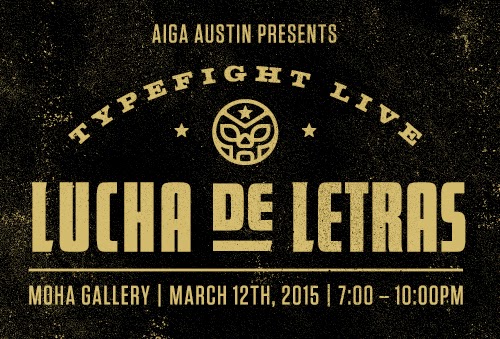
Deyton #6.5 (CHECK OUT!)
This looks like it could be really fun.
$15 admission though (only $10 if you are an AIGA member).
Cantara Ali : Week 6
This is a poster that was displayed around JCM last semester for the visiting artist Anahita Ghazvinizadeh. The typeface used looks to me like a geometric sans serif like Univers. Because this poster's purpose is to inform the student body of the lecture, I tend to cringe at the justified block of text in the lower right hand corner. The artist's name tracked out and justified looks a little strange as well. The upper left hand corner is more successful. The avant-garde spacing works with the title and the subject matter. The artists name looks better flush right and the date place and time are organized and readable. This poster reminds me that concept is important, but so is readability. As I move forward in typography I have to keep in mind that there needs to be a balance between breaking and following rules.
Bria Crain: Week 6
This example of type is a headline for an article in the 2015 Communication Arts Interactive Annual, read by designers around the world. The sans serif fonts—condensed, italic, and bold—were hand lettered (although for the bottom two, it is hard to tell without seeing the edges up close/in person). They are left intentionally rough. The article is about Carson Ellis, an illustrator known mainly for her children's book illustrations. The rough brushed texture and style of the lettering is reminiscent of her illustration style, a sliver of which you can see to the right of the headline on the opposite page. She also uses a lot of hand lettering in her work, so this type treatment is appropriate for an article about it. I would like to work on my hand lettering, and this is a good example of the technical aspects done well—letters are kerned and all are sitting on the baseline, etc. Often, these things are ignored when hand lettering (although when it's done intentionally/for a purpose, it's okay—that's a different story).
Monday, March 2, 2015
Brooke Garner
I found this example of type
on a product called Synergy that I have started to purchase regularly. Synergy
is a brand of live-culture Kombucha, which provides numerous health benefits.
Since this drink promotes digestive health and immunity, as well as supports
healthy aging and overall vitality, the audience for this product includes
anyone wanting to gain health benefits. The typeface for the word “Synergy”
appears to be similar to the serif typeface, Baskerville, because of the high
contrast, generous proportions and crisp edges. I believe this typeface is
appropriate for the product because it is soft with rounded bracketed serifs
and appears perfectly made, yet natural, like the product. I like how the
description of the product is in all lower case, mixed with the important parts
of the product, such as the title and edition in all caps. I was attracted to
this product by the packaging design. The type is spread out and allows a lot
of white space without any information being lost, which is appealing to the
eye. I am very interested in product design packaging and I think I could potentially
focus on it in the future. With this in mind, I will have to make sure that the
type works well with the concept behind the packaging of a product and the feel
it wants to give off to it’s potential buyers. Without proper typography, the
packaging will simply fail. I need to be sure to give a particular hierarchy to
each part of type in any packaging that I do.
Subscribe to:
Posts (Atom)