Wednesday, February 11, 2015

Exhibit Poster


This is a poster for a Bauhaus exhibition at the Metropolitan Museum of Art. The poster has minimal use of color and has text arranged diagonally. Furthermore, the text is either in all caps or all lowercase, which was another characteristic of Bauhaus design.

Tuesday, February 10, 2015

Starbucks - Amber Rowland

The type (Gibson Bold) looks sturdy and dependable, just like the kind of coffee they deliver. They company embraces the stability desired by their consumer when advertising their beverages. By choosing a bold weight, they are making a promise to their customer that their coffee will be bold and strong. The designer chooses to remain simple in design, because people without their coffee will be looking at it and there is no need to give them a headache when they are already grumpy. 

Hannah Larsen


Bria Crain: Week 3

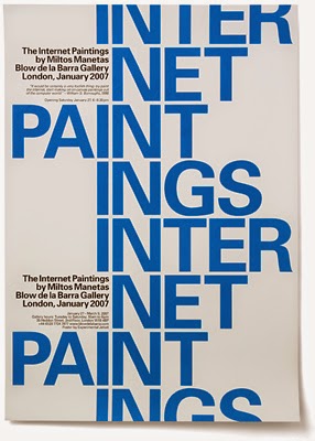
This example of Swiss typography is by Experimental Jetset, a design group based in Amsterdam. Here, they've used Univers, a neo-grotesque sans-serif (designed by Adrian Frutiger) to advertise for an art show called "The Internet Paintings"—Miltos Manetas' painted collages of webpages and other images found on the Internet. The audience for the show and therefore this design would be anyone interested in contemporary art. The design was created to function as both a poster (in blue) and a folded invitation (in red) for the event. I really like the layout; it is simple, but the offset text provides a lot of visual interest. The only thing I would criticize is how the text appears when folded. The layout works, but the large red text ends up reading as "PAIN" (or "IN PAIN") which is awkward and slightly distracting. However, if pain was somehow an underlying theme of the show and this was done intentionally, it would be clever. (For the record, Experimental Jetset says that it was an accident.) I'll be using this design both as inspiration for future layouts and as a reminder to pay attention to how your type will read at every point in the process.

Monday, February 9, 2015

Post 2: Modern

This title page is, for me, a very inspiring piece of modern typography. What looks to be a geometric typeface is arranged in such a simplistic manner that the hierarchy of the text is clear. The abundance of white space makes what little text is actually on the page more prominent and readable, despite the small point size. The offset faux-spine is completely free, the only element crossing it being the subject of the book's name. The work of Josef Albers, who appears to be part of the Bauhaus movement himself, directly inspires this successful page layout.

Madison Hanlon


Blog 3:


This is a 1923 poster postcard for the Bauhaus Exhibition Weimer. I love the typography used, it has a clean handwritten style to it. I also like how the type works with the lines and shapes, it has a very chaotic but flowy feel. The lines match the objects width just enough that the words don't get lost. I would like to play more with clean handwritten typography. I believe its a good way to catch viewers attention because it seems like now a days all that we see is computer baised font. It would be nice to include more fonts that are less computer generated and more free flowing.

Brooke Garner


I researched from the AIGA website under inspiration and Armin Hofmann came up on my page, so I further researched some of his work. The poster above, die gute form, shows strong typographic elements from Swedish designer, Armin Hofmann. This style emerged in the 1950’s and became known as the International Typographic Style. Armin Hofmann is known for challenging students to strip away what they know, or think they know, and start all over again with their typographic studies. The poster was for cultural clients such as Kunsthalle Basel and the Stadtheater Basel.
The sense of structure and space, which makes sense being that, die gute form, means, “good design.”
The type is a san serif, and is in a flush left, ragged right format. However, I find it a little odd that the smaller text toward the bottom left of the poster is flush right, ragged left. The poster still seems balanced, simple and visually pleasing as far as the form it makes and the placement on the page. Our eyes can easily fill in where part of the letterforms have been subtracted, which I think is important when wanting our type design to be legible. I like that the poster includes only black and white. Also, I enjoy the use of negative space that fills the small gaps between letters, which help create a dramatic effect and focus on the type form. I hope to reference Armin Hofmann’s design work and be able to create simple, purposeful expressions of form when dealing with type. I will use this resource to remember the structure of letterforms and to try and keep a balance for my future designs.