Tuesday, March 17, 2015

... .--. .-. .. -. --. / -... .-. . .- -.-

... .--. .-. .. -. --. / -... .-. . .- -.- translated is Spring Break.

This week's inspiration comes via typefaces derived from Morse Code. I am very intrigued by all things code and although Morse is fairly commonplace in today's society, I love to see the integration of it in typeface, art pieces and posters.

This particular post inspires me as a designer because Morse Code, in it's own way, utilizes the bare aspects of letters and numbers in a format that can easily be transmitted through radio frequency, light exchanges, etc. A lot of artists use Morse Code to convey exactly what they want through a level of intrigue and the necessity of work for the viewer.

The first photo is a typeface that took essentials from Morse Code. Once you compare the typeface to the actual letter breakdown of Morse, you can see what elements the designer had in mind when he did this.

Monday, March 16, 2015

Deyton #8 (spring break 1)

So I went to the AIGA event last week called "Luchas de Letras". I really had no idea what to expect, but basically there were two designers that were competing for three rounds. Each round they were given a random letter and 30 minutes to design and decorate that letter, and we are given these little tokens to vote on who won each round.


It ended up being so much fun and I wish I could have stayed for the whole thing.
First, I would like to say that the venue was awesome, and the Austin chapter of AIGA is really bad ass at putting these events together. It was an old warehouse-looking building and inside they had 2 kegs and some snacks in the middle of a really cool little art exhibit. The art had nothing to do with the event but they did have a little stand set up advertising the event with goods to buy. (Please ignore the horrible quality of my pictures).


Once the show actually started we went into the other side of the exhibit and the warehouse was set up like a boxing match. They had a boxing ring and folding chairs. Here are some more awful pictures of what went down. The last picture was the end of the first round. (I voted on the cowboy A).  


(and here are some much better photos I stole from their Facebook page):


Tuesday, March 10, 2015

Cantara: Week 7


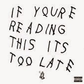
I'm sure everyone has seen this around the internet, but for those of you who don't recognize this picture, its the cover of music artist Drake's mix-tape he released earlier this year. The scrawl of handwritten type has instantly become an internet meme but I could not find who did the cover. The type looks as nonchalant as the release of the mix-tape from the popular artist. The letterforms are consistent but that is as far as this design goes when sticking to the rules of good typography. The kerning in the word "reading" is uneven and the tracking is inconsistent, but sticking to the rules isn't the point. This cover clearly says "I am defying expectation". This design is inspiring to me because it keeps just enough convention to be design, but eschews all the rest to challenge the nature of design. I do want to be able to do projects that ask questions about visual communication.

Brooke Garner


This example of type is a cover for Ellen Lupton’s book, Graphic Design Thinking: Beyond Brainstorming. The san serif fonts are bold and seem to be hand-rendered because the edges of letters look imperfect. The letters are all kerned out perfectly though, unlike how handwriting is naturally. But it still works. The book is about how creativity is more than a talent, but a learned skill. Ellen Lupton discusses how to get ideas with a range of techniques from quick, to formal research methods. The cover is perfect for Ellen Lupton because she is known to like hands-on and up-close approaches to design. Many designers can relate to the image behind the title that bleeds across the cover. Brainstorming using methods such as mapping is an important process to help get ideas flowing and eventually help create form. This type example works very well because it is hand-rendered and relatable. Our thoughts as designers are usually a little scattered in the brainstorming process, so a structured map would not work as well for this cover. The book’s audience is directed towards design students or anyone that wants to find a way to apply creative thinking to everyday life. I enjoy hand-lettering and hands on projects, so I just need to practice to get better and use it appropriately in my design work. Also, I am looking into purchasing this book to have as a resource because the design process is difficult for me at times, and I get a little stumped. 


Swertfeger, Aidalicia

I decided on this example because I am huge into minimalism and find it challenging to represent it in the world of typefaces. In my opinion, when minimalist type is done correctly, it is not only beautiful but pushes your mind a bit further for the overall message. When done incorrectly, as is the case more often than not, you lose the viewer, the message and your credibility.
This specimen aids my design skills but ensuring I pay attention to detail: does my minimalist typeface application read? Does the viewer lose interest in trying to piece together the text? I also will say I've only seen a handful of serif minimalist typefaces, as I'm sure it's difficult to pull off with all the serifs and embellishments.


Kara Albe

This bloody Mary mix was at HEB, and it caught my eye obviously because of the bright bold colors and graphic elements. I love the illustrative quality and the way each bottle works together to create a consistent brand. 3 different fonts of a slab serif are used along with a nice display sans serif. Good hierarchy is established and it feels very Texan but new and fresh, which is what I believe the brand is trying to achieve.

Bria Crain: Week 7

This is a poster created by illustrator Matt Taylor for the movie Dallas Buyers Club. Although not an official movie poster, it is still intended for the audience of moviegoers and is meant to interest people in the film. There are two styles of sans-serif fonts and one script font. This poster stood out to me because the type used for the movie title is also an essential part of the illustration, integrated into the signage. It really draws the viewer in; without the type on the sign, the poster would lose a lot of its effectiveness. In future design projects, I'd like to try and integrate my type with my images and experiment with type created as or out of objects.