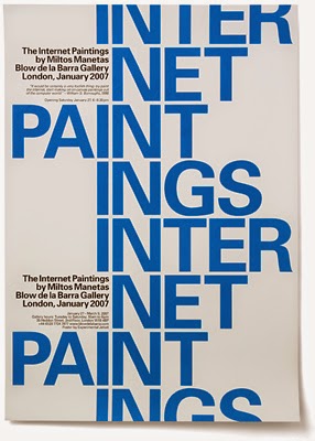

This example of Swiss typography is by Experimental Jetset, a design group based in Amsterdam. Here, they've used Univers, a neo-grotesque sans-serif (designed by Adrian Frutiger) to advertise for an art show called "The Internet Paintings"—Miltos Manetas' painted collages of webpages and other images found on the Internet. The audience for the show and therefore this design would be anyone interested in contemporary art. The design was created to function as both a poster (in blue) and a folded invitation (in red) for the event. I really like the layout; it is simple, but the offset text provides a lot of visual interest. The only thing I would criticize is how the text appears when folded. The layout works, but the large red text ends up reading as "PAIN" (or "IN PAIN") which is awkward and slightly distracting. However, if pain was somehow an underlying theme of the show and this was done intentionally, it would be clever. (For the record, Experimental Jetset says that it was an accident.) I'll be using this design both as inspiration for future layouts and as a reminder to pay attention to how your type will read at every point in the process.