Tuesday, April 7, 2015

Brooke Garner


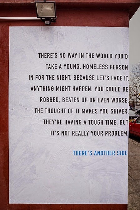
This is a poster campaign by Publicis, London for homeless charity DePaul UK Nightstops. Designers, Dan Kennard and Ben Smith were working on a design to change the perceptions of those that do not get involved in volunteering because they worry about their personal safety. Kennard and Smith came up with a poster design that would wrap around the corners of a building providing a different view on each side. The left-hand side of the poster provided people's preconceptions of volunteering for young homeless people, and the right-hand side provided a message to show that there is a positive side of volunteering.  The designers used font DIN condensed for this poster which I think works very nicely for readability purposes and the way the sentences are broken up. Each side of the poster appears to stand out on it's own, however, one could not exist without the other. I like that the poster is simple and lacks images because the focus is on the impact of type alone. The large amount of white space is good because it allows the viewer to read the text easily when passing by. This poster will inspire me to focus on using type alone as a solution to enhance the impact of a design, when the subject is appropriate for it.


Album Art - Amber Rowland

The combination of San serif and script type provokes a timeless feeling that well suits the artist. This is especially important for the genre of music and artist. The design particularly speaks to the younger generation of adults   

Deyton Koch #11

I am up way too late working on some homework, and I just realized I forgot my blog. I used an internet source last week and I am too lazy to get up and find something so I emptied my purse. I actually have a pretty extensive collection of business cards and I happen to have some with me now, and they are actually from designers that I met at creative mass a couple of months ago, (which should be tonight fyi). These are two of my favorites.


Yes, this one was probably chosen because of the llamadillo, but for as crazy as that animal is, the type is clean and professional. The back is not as great, but the line work is really appealing on this side of the business card and the red slab is a "strategic execution" because it is intriguing and it really makes me want to turn the card over.


This is such a cute idea, and it really is a sticker. The name tag template is spot on and I think he did a great job with the hand-rendered text (I would, however, like to ask him about the reasoning behind the purple), but he really dropped the ball on those bottom bits of information. It's a random typewriter font that does not go with anything. And as a creative he should know that black on red is really difficult to read, made even more difficult by that font that he has to tightly kerned and way too bold.


This business card is one of my least favorites, ironically because he is a graphic artist. Last week Blake asked about print shops we know of, and this is one NOT to use. How can you take them seriously with this business card. There is way too much information and just as many different typefaces. It is so cluttered and hard to read. There is gradient! It was a cute little mom and pop store and they were super nice, but their print jobs were definitely sub par. 


This is money from Singapore.  I do not know what their official language is and these characters do not look familiar at all. This bill is actually really gorgeous but I wanted to direct attention to the type at the very top left-hand side. It looks like someone hand wrote it with one of those pens that vibrate. And along with the outline around the other type, it makes the money look very unofficial, but it is so difficult to critique a totally different alphabet. 


This was just added for laughs. That is how long it has been since I cleaned out my wallet.

Bria Crain: Week #10


This week's example comes from the 2015 Communication Arts Typography Annual. It is the logo for Monier, an office building in Norway, which was designed by Ludvig Bruneau Rossow.  The office building was scheduled to be completed in early 2015 and was in need of a strong logo and identity to attract potential renters. Rossow created a custom sans-serif typeface for the logo inspired by the cubist architecture of the building itself. He wanted to reflect the Monier's three-sized window concept, so he created three different widths of the alphabet. As you can see in the images, there are both 2-D and 3-D versions of the logo.  In promotional materials, as demonstrated in the .gif above, size and placement of the boxes/letters varies following the three-sized window system. I love how versatile the logo is; it's always recognizable despite the many different versions. This inspires me to try and create systems in my branding work that allow for variety.