

Saturday, February 28, 2015
Kara Albe
Friday, February 27, 2015
Madison Hanlon
Blog 6:

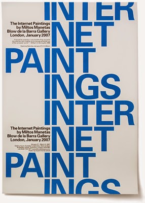
I came across this poster on Pinterest. I decided to mix up the blog by posting a "what not to do" in type design. I found this poster to be very funny. I never realized how annoying bad typesetting could be. I can honestly say I picture myself bringing this poster into indesign and manually fixing the kerning and leading. I know the font was probably also picked out in hopes to further "piss off your designer friends" but it actually doesn't bother me as much. I believe the font the designer used is helvetica.
Although it may make readers cringe this is such a genius design, communicating the main intention of the text. I will try to stay away from this bad choice of typesetting in future projects... unless it is used for a specific intention.
Wednesday, February 25, 2015
Cantara Ali : Week 5
This is a series of tea packaging designed by the agency Horse. There are several typefaces on this project, there is a slab serif for the logo and a script for the headers as well as a simple serif for the body text and a geometric sans serif to describe what tea or coffee type the package holds. The packaging is for tea and coffee from and eccentric British company. The mix of typefaces is quirky and hails to Victorian type practices without going all the way. The curving baselines contribute to the eccentric feeling. I hope to take this example of how to mix multiple typefaces in this trendy Victorian style without being overwhelming.
Monday, February 23, 2015
Bria Crain: Week 5

I found this example of type on Fonts in Use. It is the cover of a small publication, Design Reporter, that was released in Australia during the 2009 State of Design Festival. It was a critique of and a proposition to the local newspapers—the creators felt that there was a lack of design journalism in the mainstream press, and created Design Reporter in the style of a newspaper to show the need for it. Headlines are set in Greta Grande, a modern serif font. Greta Text, a serif font most similar to the Clarendon type classification, is used for the rest of the copy. The cover is crowded with text, but the layout works because of the size and typeface differences. There is a clear hierarchy in place. The most important elements are the largest, and the high contrast between the thick and thin stroke weight draws attention to the headlines first. The least important information is small and set in Greta Text rather than a display font. I think that using two fonts within the same family was a good choice; they were created to work together and are diverse enough to be visually interesting. I'll keep this example of hierarchy and font choice in mind when handling large amounts of text in future projects. I like that the most important elements are mixed in with the less important elements rather than set from top to bottom, most important to least important.
Deyton Koch #5


I was looking through old design text books for my blog this week. These posters are from Graphic Design Thinking: Beyond Brainstorming by Ellen Lupton, (I admit I do not remember for which class this book was for). There is so much I could say about all 8 of these posters, and I really should take some close up shots so that you can see them better. But it was how these posters were made that really intrigued me. The section I found these examples under was titled "Sprinting", and that is a term that I was unfamiliar with after 4 years of design school. Anyway, "sprinting" is a "technique for breaking out of your own habits by forcing yourself to come up with a new visual solution in a fixed time frame and then moving on quickly to try something else". So these posters were intentionally designed very fast (I will include the details in this blog), both for typographic experimentation and the results are successful in some very diverse ways. Obviously, they could be polished up, but that is irrelevant. This sounds like a useful assignment to try myself, especially if I feel like I am stuck or need inspiration, or just want to force myself to try something new.
Twitter Typography Series (left). These posters use tweets from the five most heavily subscribed Twitter feeds between October 13 and 15, 2009. In order to experiment with typography in a quick, immediate way, the designer created one hundred posters in a series of thirst-minute design sprints. She chose twenty-five designs to print and display. Design: Krissi Xenakis.
Mars Book Sprints (right). The designer employed sprinting in order to generate multiple typographic concepts for a book design. Her parameters included using variations of a centered grid, using only black and white, and using only the typefaces HTF Whitney and Bodoni. The text is from Carl Sagan's Cosmos (1980). The designer created a total of twelve page variations. Design: Christina Beard.
Vikings-Danika
 Vikings. This TV series has a beautifully kerned San serif in all caps across the spread, with a highly decorative capital. The Nordic knots entwined in the large V show a strong since of culture and history, while the blood stain represents the violent past and fame of this culture.
 Jennifer Hernandez Post 3

Jessica Prohl


Sobek is a futuristic typeface that I think is really interesting. I hope to have use for it in the future (ahahah), because it's really beautifully rendered and surprisingly readable, even though the forms are not the most conventional.
Friday, February 20, 2015
robert johnson 2/21/15

There is a scratchy quality to the main text that feels dirty and beaten up, further reinforcing the gritty theme of the movie. Personally I see this kind of typography as some of the most applicable to my own style, and I feel like using subtle type features that reinforce concepts of whatever artwork they accompany will be a big part of my typography choices in the future.
Madison Hanlon
Blog: 5

Text on text on text. This is a page from the Washington Post magazine in 2012. I love the idea of making typography out of simple objects such as peeled back paper. I think this is a creative way to display typography. Not only did the designer decide to make a title out of this, but they also decided to add in text into the slits of the title. The viewers eye has a lot to look at, but still are not overwhelmed with what is going on. I think the way this layout is set up its interesting but still clean. I also love the amount of different styles of text used for this cover. You have bold, thin, and cursive working together. I would love to incorporate this creative idea, using simple objects to make text, in my own work. I feel it would be a cool design for future projects.
Tuesday, February 17, 2015
Kara Albe

Kara Albe

robert johnson 2-17 blog post

In my own work, I see the use of color for emphasis as hugely helpful as an alternative to font size as it is just not possible sometimes to make font size properly convey the message in situations where space is an issue.
Bria Crain: Week 4


I found this advertising campaign in the September/October 2014 Communication Arts Design Annual. Milto Cleaners is a small, family-owned dry cleaning chain in Indiana that was founded in 1970. They wanted an update to their branding to communicate the experience and care that goes into their dry cleaning. Molloy Design used a slab serif font to give the advertising materials a traditional, yet modern feel. It helps to communicate to potential customers that Milto Cleaners has been around long enough to become masters of their craft, but that they aren't out of touch or too old-fashioned. This campaign shows that the right font can convey your message without having to directly state it, which I'll keep in mind for future design work.
Monday, February 16, 2015
Professor's Website

I was surprised when I discovered that this site belonged to a medieval history professor. The old german style fonts and distorted serif typefaces give this website a distressed appearance.
Brooke Garner

Young House Love by
Sherry and John Petersik is a book intended for do-it-yourself home improvement
projects for people looking to improve their home décor with budget friendly
ideas. The couple shares their tricks and techniques for ways to craft, paint and
show your own home some love. I found this book on my friend’s coffee table and
began to browse through and found some interesting ideas and tips to improve my
home. The typeface on the top half of the cover is a san serif in all caps. The
word “love” in cursive with a picture of the Petersik’s in front is important
because it suggests that the couple is close and that their ideas intertwine
and flow well together. The front includes materials such as a paintbrush and
wooden letters that symbolize and foreshadow possible projects that are within
the book. The type used is very appropriate because it feels very fresh and
modern. The white space surrounding the title of the book is nice too because
it allows focus on the type as well as symbols on the type. I do not believe
that this cover would work if the type were to be taken out. This example will
influence me to allow more white space in my work and let the type speak for
itself, rather than having distracting designs within the background.
Madison Hanlon
Blog: 4
 I happened upon this typeface while scanning through my Pinterest feed. I believe this window is from a city building, probably New York. I love how the white of the type color stands out on the window. I think this typeface is a fun and new way to design type. I was really attracted to the choices the designer made. I like the idea of making some letters open while filling some letters in. If you look at each individual letter you notice that they are all different in their own way. Some of them look almost 3D while others look broken or offset. I think its interactive with ones eye and draws the attention of viewers. This image makes me want to play around with different ideas and shapes dealing with type. I love it, it's so creative!
Lets take a moment to "appreciate" how much this sucks...
.JPG)
Ye ol' Power Plant
We've all seen it. This typeface originates from the sans serif category as humanistic,
which is noted for the obvious weight contrast. The typeface also seems
to be a throw back to art nouveau, a particular art movement near and
dear to my heart. This inspires my future designs because type can be as
phenomenal as any building. Type can be a literal landmark.

Deyton #4
I was stuck at my aunt's and uncle's house all weekend in Dallas and we were all very sick, so I just went through their magazines and I found a spread that I liked to blog about.


I do like this spread because it is simple yet grabs the reader's attention and I liked their layout and grid, but I do see some stuff I would have changed. For one thing, I count at least 5 different type faces, and they do not really work together because of how different the styles are, especially the weights of the letters. The types faces also cause a hierarchy problem with the headlines on the second page. The subheads are much more bold and draw the eye, while the headlines are thin and compressed and hard to read, especially when they put it with the purple background. All the being said, the fonts are actually very interesting if you look at them. The word "cruising" on the first page looks cropped, and I can't tell if the subheads on the second page are the same typeface, but instead of all caps they are all lower-case, but it is just an interesting font. I like the font very much, but I think the rest of the article feels too professional or classy for it.
P.S. This is awesome:
Saturday, February 14, 2015
Oscar Wilde Cover: Week 4

This book cover was designed by Stefanie Posavec. The illustration is very striking but the type is still very beautiful without competing with the illustration. The type is a combination of sans serif and a hand-done-looking script. This is a paperback cover for Oscar Wilde's The Picture of Dorian Gray and the intended audience is anyone who would like to read this classic, whether for school or leisure. The thin, geometric sans serif creates easy and instant recognition of Wilde's work, while being very stylish and modern, like Wilde was in his day. The script title hints at Victorian hand-written letters. The title fills the space behind the young man, creating space between the illustration and the type. It looks a bit like he is turning away from the type, like how Dorian turns away from his portrait in the book. This strong conceptual connection is inspiring and is a great example of creative typography for my own work.
Modern Type, #3

This example of modern typography is from the book Graphic Styles : From Victorian to New Century. The specific example I want to write about is the top image which is a poster designed by Max Burchartz. The use of bold, all caps, sans serif contrasts nicely with the placement of the photos. It's a poster advertising the Schubert Festival in Austria, which holds concerts for classical style musicians to this day. The box of text draws attention to the information within and the text runs up to the edge of the box, though it doesn't look like too much. The point size changes create a clear hierarchy. I think that this organization is a great example to reference to in my work.
Wednesday, February 11, 2015
Exhibit Poster

This is a poster for a Bauhaus exhibition at the Metropolitan Museum of Art. The poster has minimal use of color and has text arranged diagonally. Furthermore, the text is either in all caps or all lowercase, which was another characteristic of Bauhaus design.
Tuesday, February 10, 2015
Starbucks - Amber Rowland
The type (Gibson Bold) looks sturdy and dependable, just like the kind of coffee they deliver. They company embraces the stability desired by their consumer when advertising their beverages. By choosing a bold weight, they are making a promise to their customer that their coffee will be bold and strong. The designer chooses to remain simple in design, because people without their coffee will be looking at it and there is no need to give them a headache when they are already grumpy. 


Bria Crain: Week 3

Monday, February 9, 2015
Post 2: Modern

Madison Hanlon
Blog 3:

Brooke Garner

I researched from the AIGA
website under inspiration and Armin Hofmann came up on my page, so I further
researched some of his work. The poster above, die gute form, shows strong typographic elements from Swedish
designer, Armin Hofmann. This style emerged in the 1950’s and became known as
the International Typographic Style. Armin Hofmann is known for challenging
students to strip away what they know, or think they know, and start all over
again with their typographic studies. The poster was for cultural clients such as
Kunsthalle Basel and the Stadtheater Basel.
The sense of structure and
space, which makes sense being that, die
gute form, means, “good design.”
The type is a san serif,
and is in a flush left, ragged right format. However, I find it a little odd
that the smaller text toward the bottom left of the poster is flush right,
ragged left. The poster still seems balanced, simple and visually
pleasing as far as the form it makes and the placement on the page. Our eyes
can easily fill in where part of the letterforms have been subtracted, which I
think is important when wanting our type design to be legible. I like that the
poster includes only black and white. Also, I enjoy the use of negative space
that fills the small gaps between letters, which help create a dramatic effect
and focus on the type form. I hope to reference Armin
Hofmann’s design work and be able to create simple, purposeful expressions of
form when dealing with type. I will use this resource to remember the structure
of letterforms and to try and keep a balance for my future designs.
Jessica Prohl

I had already done a Bauhaus photo last time. I found this bottle today and decided to buy it. I really like the type choice they used on the label; it looks hand rendered and fits the illustration. The engraved part of the glass also really completes it. The "Fruit Punch" choice is a little cheesy, but the rest is nice.
This just in: Sweden Sans


Soderhavet utilized present Swedish design to create a typeface that was minimal, clean & sleek; this typeface would also be able to utilize a paired down color schematic depending on the platform.
Soderhavet hit the pavement and pulled examples of Swedish typefaces from the streets, seeking to refine a common theme which carries an expression: lagom. This phrase means not too much and not too little. Content with the in-between.
The end result is the typeface Sweden Sans, which will be used to brand Sweden as a country. This practice is common for cities, but not necessarily for countries.
Learning about Sweden Sans & the concept of branding an entire country is very interesting to me. I believe it will aide my understanding of typography because it utilize a wider perspective. The design house commented that designing a typeface is the clothing for the alphabet: it communicates an attitude. This is an interesting idea and one I will remember throughout my design career. The design house also mentioned you can really never mess with the letters A or E because those are the most noticeable. Once a person can make a distinction, you've lost.
Bauhaus Movment
The Bauhaus changed type and design for ever. I was at Half Price books looking at some old magazines in San Antonio and I was admiring the bold, yet not neon color choices that the Bauhaus decided to run with. In this first picture I enjoyed the white space and the over lapping large letters, expertly where the a and u line up. The second one has a strong sense of line and shape, then enter-grading type into the grid. the third design i was pulled to has over sized letters bleeding into one another creating beautiful shapes that fade in and out of the readability zone. Finally the 4th one is a modern poster that has stolen inspiration from the Bauhaus, using the full round O and a extended fount, this shows just one very small example of how the Bauhaus moment has influenced us today, knowingly and unknowingly.


Sunday, February 8, 2015
Ashley Tann

Image found at TM Research Archive
This is the cover of a 1964 Swiss Typography Magazine, Typographische Monatsblätter. The purpose of the magazine was to examine Swiss typography and design and expose it to an international audience. The magazine has been used as an important tool in understanding the history and development of modern design. This particular issue was designed by Felix Burman in the typeface Univers. This design has a great sense of hierarchy. Even though the image takes up most of the page, it's clear that the information at the top is important. The rules help bring attention to the information and the different type sizes also indicate hierarchy. The design is sleek and organizes a lot of information in a very simplistic way. I love the longevity of Swiss typography. In the design world, there are a lot of trends and it always amazes me how modern and sophisticated 1960s Swiss design looks.
Swissted


See the full collection here.
Subscribe to:
Posts (Atom)