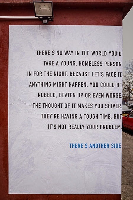
This is a poster campaign by Publicis, London for homeless charity DePaul UK Nightstops. Designers, Dan Kennard and Ben Smith were working on a design to change the perceptions of those that do not get involved in volunteering because they worry about their personal safety. Kennard and Smith came up with a poster design that would wrap around the corners of a building providing a different view on each side. The left-hand side of the poster provided people's preconceptions of volunteering for young homeless people, and the right-hand side provided a message to show that there is a positive side of volunteering. The designers used font DIN condensed for this poster which I think works very nicely for readability purposes and the way the sentences are broken up. Each side of the poster appears to stand out on it's own, however, one could not exist without the other. I like that the poster is simple and lacks images because the focus is on the impact of type alone. The large amount of white space is good because it allows the viewer to read the text easily when passing by. This poster will inspire me to focus on using type alone as a solution to enhance the impact of a design, when the subject is appropriate for it.


No comments:
Post a Comment