


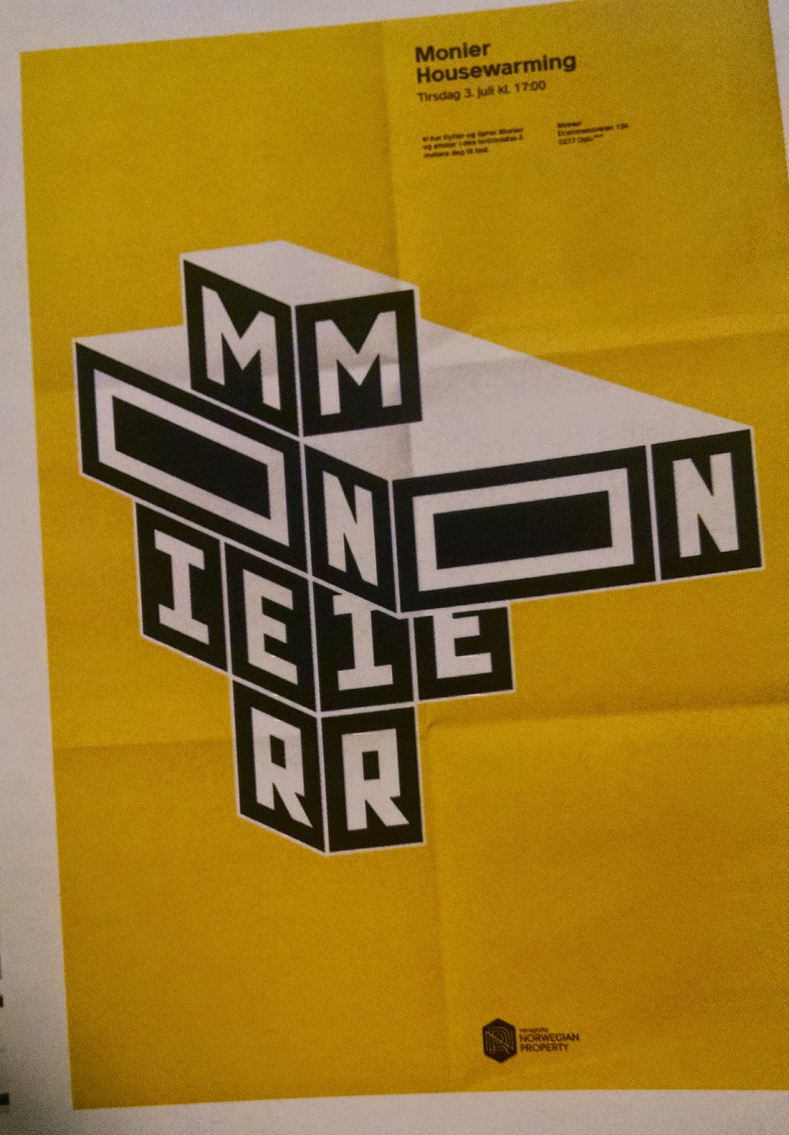
This week's example comes from the 2015 Communication Arts Typography Annual. It is the logo for Monier, an office building in Norway, which was designed by Ludvig Bruneau Rossow. The office building was scheduled to be completed in early 2015 and was in need of a strong logo and identity to attract potential renters. Rossow created a custom sans-serif typeface for the logo inspired by the cubist architecture of the building itself. He wanted to reflect the Monier's three-sized window concept, so he created three different widths of the alphabet. As you can see in the images, there are both 2-D and 3-D versions of the logo. In promotional materials, as demonstrated in the .gif above, size and placement of the boxes/letters varies following the three-sized window system. I love how versatile the logo is; it's always recognizable despite the many different versions. This inspires me to try and create systems in my branding work that allow for variety.
No comments:
Post a Comment