Tuesday, March 10, 2015
Cantara: Week 7
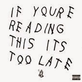
I'm sure everyone has seen this around the internet, but for those of you who don't recognize this picture, its the cover of music artist Drake's mix-tape he released earlier this year. The scrawl of handwritten type has instantly become an internet meme but I could not find who did the cover. The type looks as nonchalant as the release of the mix-tape from the popular artist. The letterforms are consistent but that is as far as this design goes when sticking to the rules of good typography. The kerning in the word "reading" is uneven and the tracking is inconsistent, but sticking to the rules isn't the point. This cover clearly says "I am defying expectation". This design is inspiring to me because it keeps just enough convention to be design, but eschews all the rest to challenge the nature of design. I do want to be able to do projects that ask questions about visual communication.
Subscribe to:
Post Comments (Atom)


No comments:
Post a Comment