
Source: http://www.mariohugo.com/work/c8xdmy1omjdenj7zvvl3jh5sr4v59v
Type Classification: Sans-Serif, Capitalized, Negative, Condensed
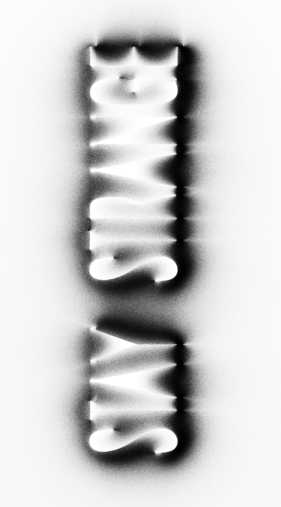
What is it?: This is a project that Mario Hugo is working on at the moment for Jessica Walsh of Sagmeister and Walsh. Those are all the details at the time.
Analyze this piece: The type looks as if it has been rendered on a xerox machine. I think he made the type out of neon first, then took it to a xerox machine. Either way, I think he did a very good job of portraying the strange qualities of type. The negative gives the type a creepy sort of feel, but the white surrounding the rest of the type makes it seem like the viewer is looking up into a hospital light. However, since he used a sans-serif, it isn't as creepy as using those thin serif typefaces. This give it the "strange" qualities.
How will this influence my work?: I haven't used a xerox for any sort of design since my first com des class. I want to pick it up again. The results were worth all of the paper wasted.
No comments:
Post a Comment